
Akuma UI
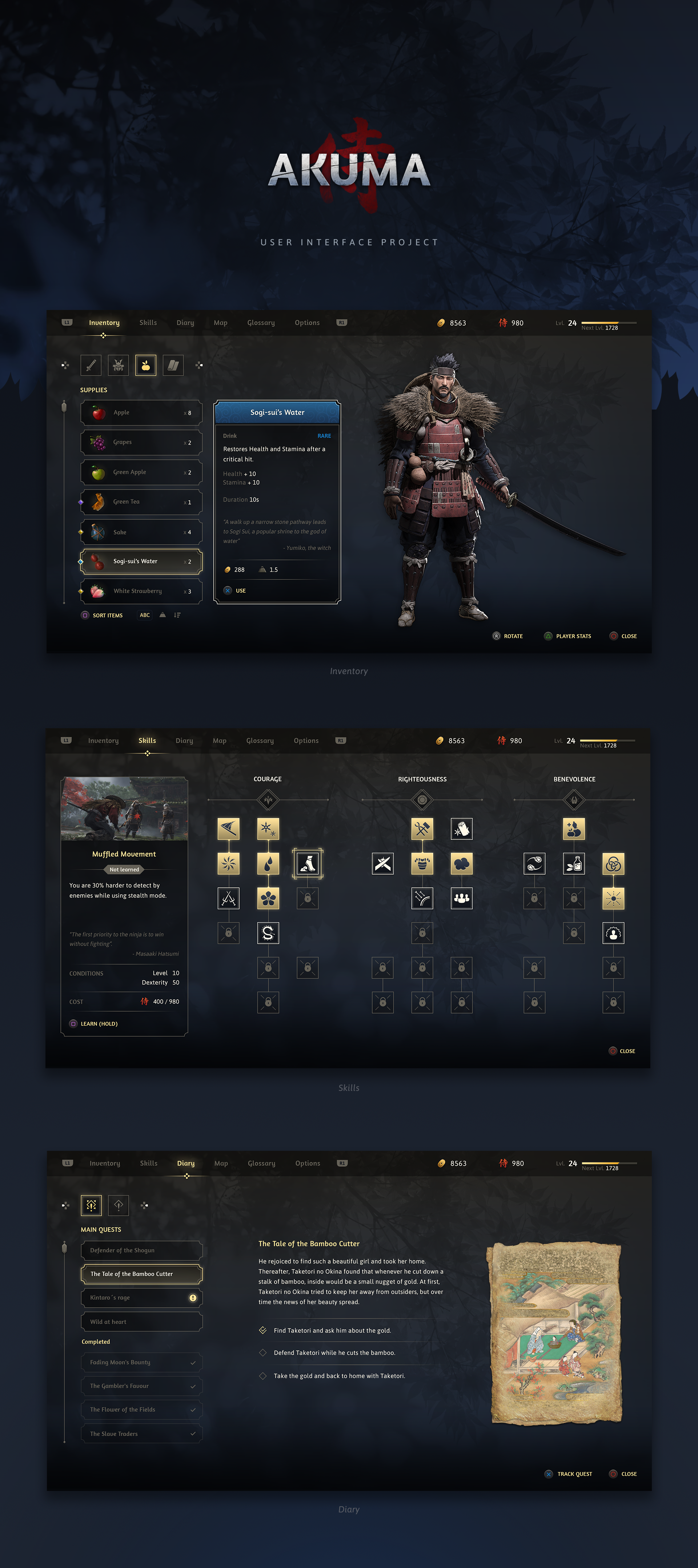
User interface for a fictional open-world RPG, including custom iconography and painted inventory items.
| Role | Timeline | Team | Stack |
|---|---|---|---|
| UI Artist | 5 months (2019) | Personal project | Figma Photoshop |
Project Overview
Akuma UI is the user interface for a fictional open-world RPG video game. Beyond the menu screens themselves, I also designed the iconography and the painted inventory items.
The project became an opportunity to explore game UI while pushing myself into a type of asset creation I had little experience with.
The samurai character shown in the inventory screen was created by Oksana Martyshenko. She kindly allowed me to use her work for this project—thank you, Oksana.
Challenge
The goal was to design a believable in-game menu system for an open-world RPG set in a Japanese-inspired world. That meant thinking beyond individual screens and building a clear layout for each menu type and a visual language.
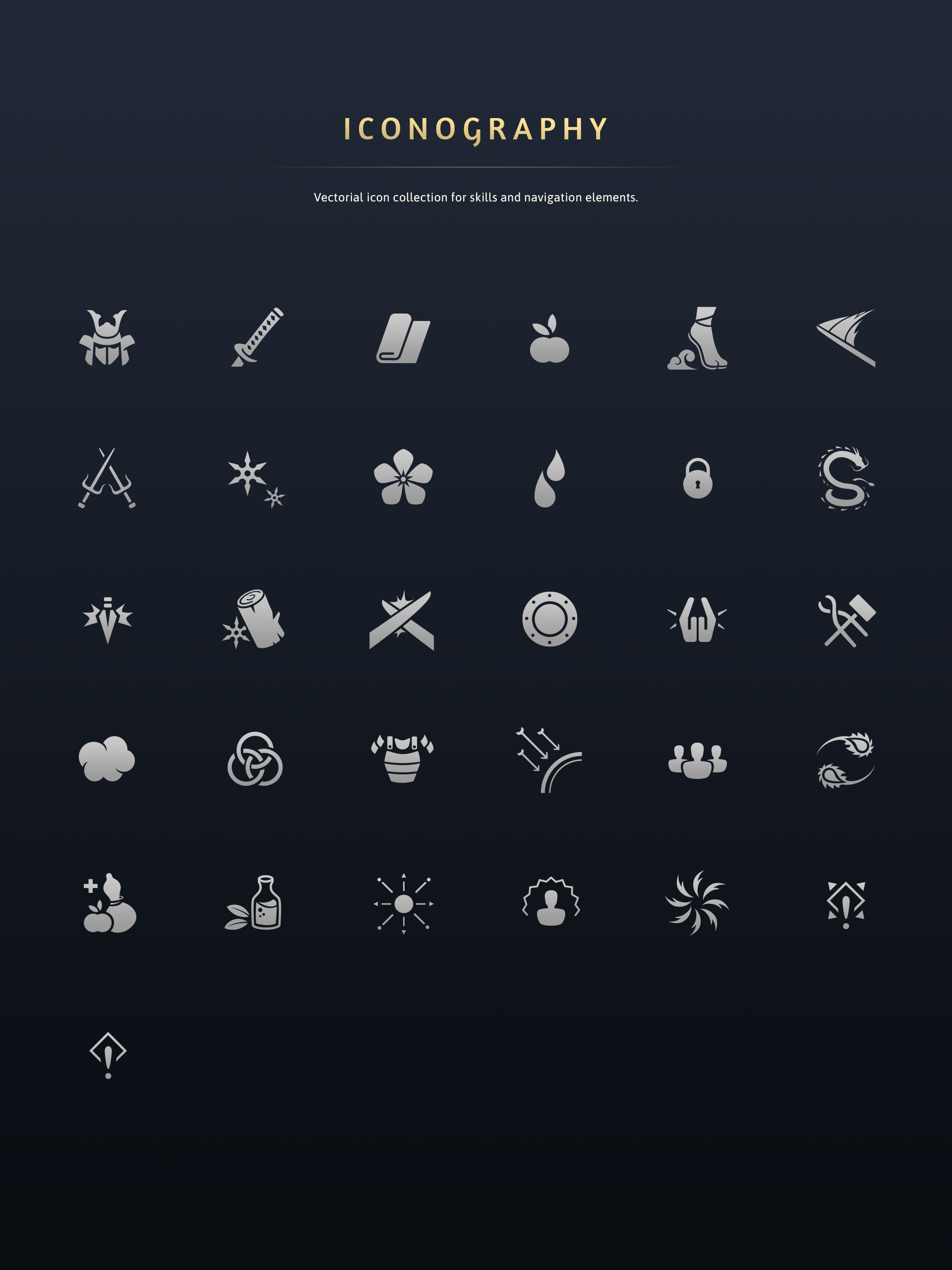
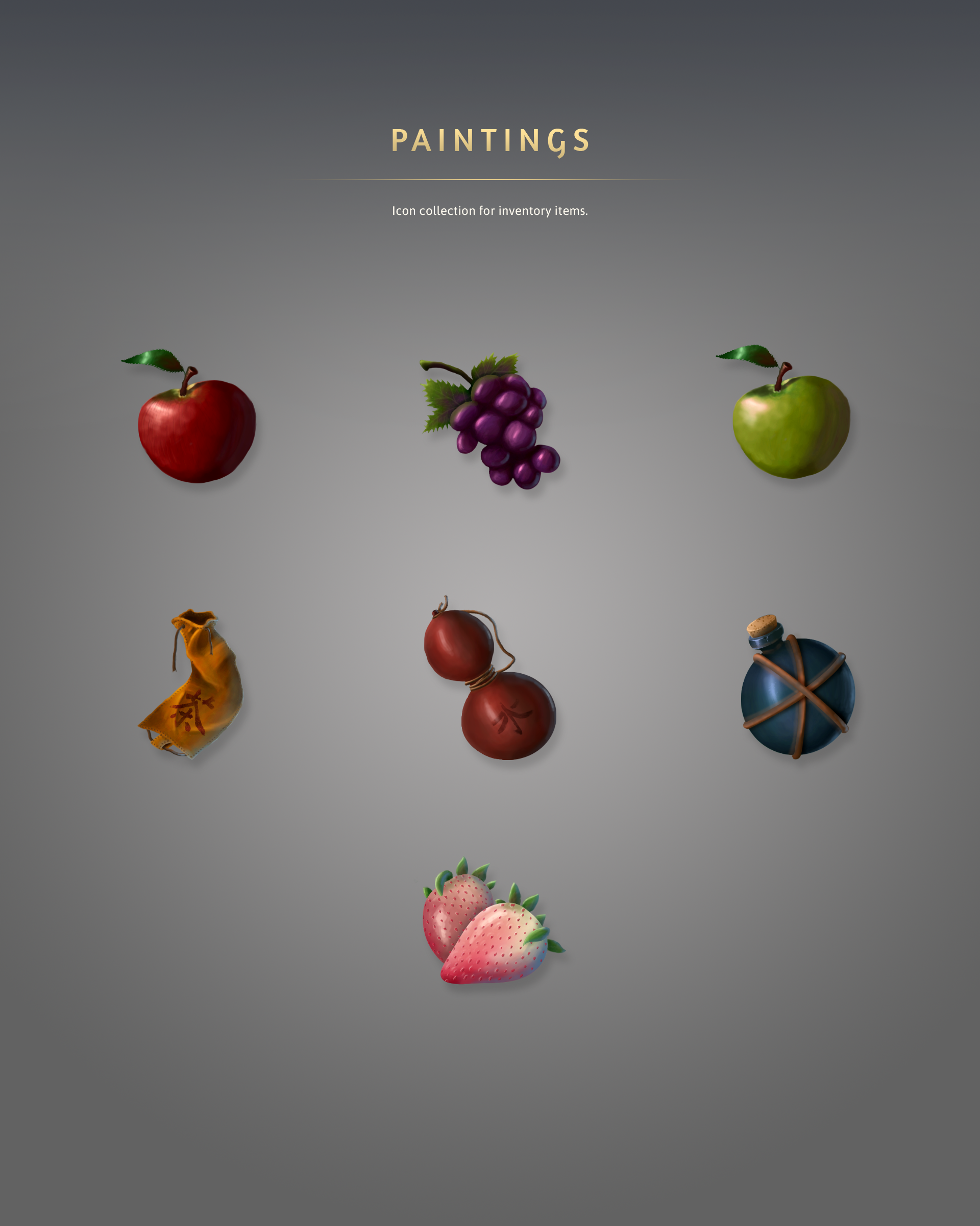
I also wanted the project to cover more than interface layout: the icon set needed to support skills and navigation, and the inventory items needed painted assets that felt at home inside the UI—even though illustration is not my strongest skill.
The Solution
The project focuses on three core screens Inventory, Skills, and Diary, connected through shared navigation. Each screen follows the same structural logic while adapting the central area to its content.
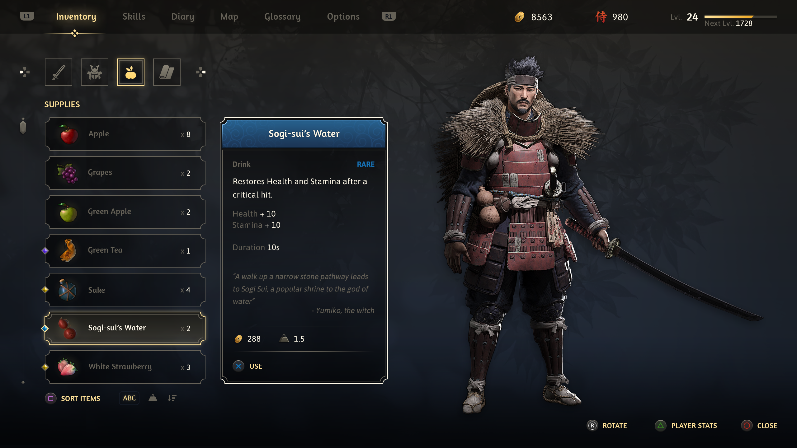
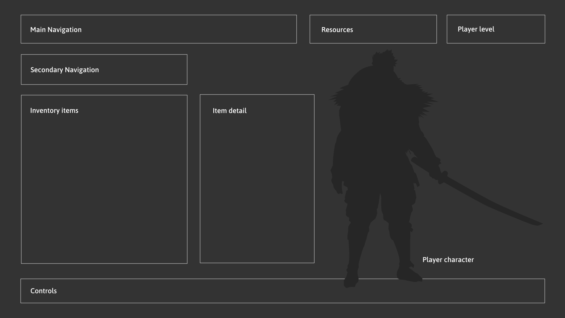
The Inventory screen combines category filters, a scrollable item list, a detail card, and a character preview. This layout makes it easy to browse items, read their stats and flavor text, and see how they relate to the player character.
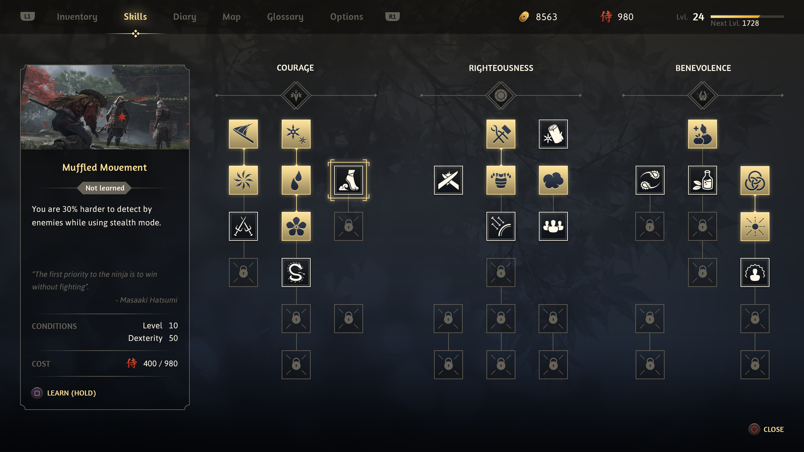
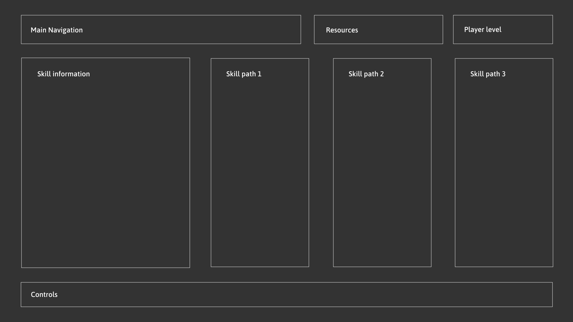
The Skills screen organizes abilities into three paths with a detail panel for the selected skill, its requirements, and its cost. A screenshot from Ghost of Tsushima (Sucker Punch Productions) was used as the preview image for the selected skill.
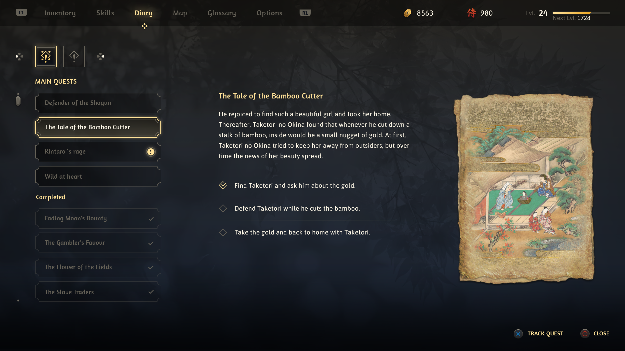
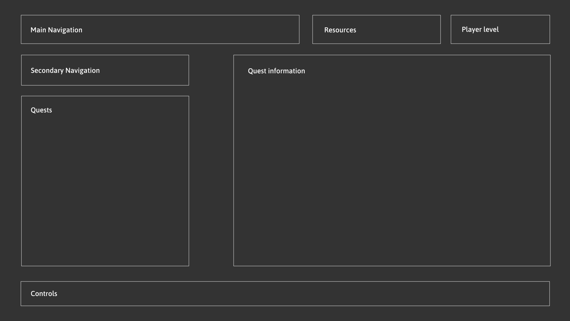
The Diary screen works as the quest log. Players can browse active and completed quests, read the story summary, review objectives, and see a supporting illustration that adds narrative context to the selected entry.
Iconography
Alongside the screens, I created two supporting asset sets:
Approach
The Process
I started by gathering ideas and references from other RPG games such as The Witcher 3, God of War, and Assassin’s Creed. I paid special attention to the navigation elements and the overall layout, since those define how readable and comfortable a menu feels during long play sessions.
Based on that research, I decided which screens to design for the project and how to distribute the elements inside each one. Once the layout felt right, I collected samurai symbology and Japanese art references from the internet to guide the visual direction.
Layout Structure
Before moving into the final visual design, I defined the structure of each screen as a wireframe. This helped me validate the hierarchy and spacing early, before adding color, texture, and decorative details.
Impact & Results
- The primary impact was personal growth and skill development.
Learnings
- I learned to study existing RPG menus with a focus on navigation and layout.
- I improved my ability to define element distribution early through wireframes, which made the later visual design stage much clearer.
- I pushed myself into painted asset creation, even though illustration is not my strongest area.
- I learned to collaborate with other designers and artists to create new projects.