
Jacaranda Design System
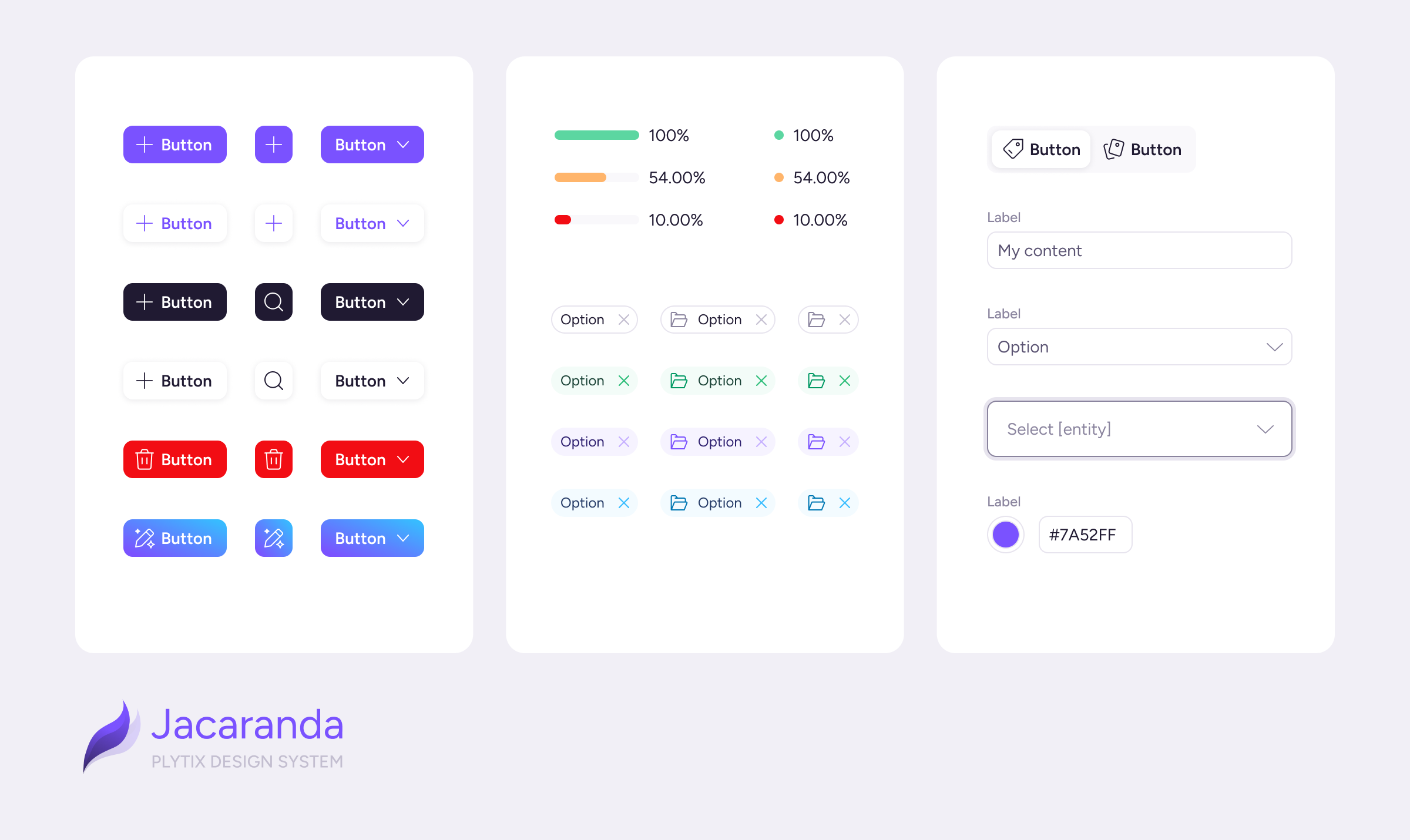
A custom design system built from the ground up to improve consistency across design and development at Plytix.
Project Overview
Jacaranda is a design system built from the ground up to help designers and developers work more consistently and communicate more effectively. It reduced UI fragmentation and enabled the team to ship product updates faster.
Challenge
The product’s UI components were based on external libraries with an additional customization layer on top. This setup created unexpected friction during handoffs and caused implementations to deviate from the intended designs. It also required developers to spend extra time refining the UI.
Component specifications and design patterns were written primarily for designers, so the documentation did not reflect how developers built and maintained the component library. The relationship between components in design and code was also unclear.
These limitations also affected our processes. Updating a single component or color became a time-consuming task involving several steps and intervention by the development team. Because updates were difficult to make, design debt continued to grow.
As the UI grew, it became increasingly difficult for designers and developers to speak the same language when discussing components.
Approach
Gathering Information & Research
The design team held workshops with product managers and developers to understand the state of the component library and identify the problems each team was facing.
After a few sessions, we had a clear view of the team’s main needs:
- Developers needed first-party components they could customize without additional layers.
- Product managers needed faster, more reliable delivery.
- Designers needed greater fidelity between designs and the final product, as well as the ability to make small adjustments more quickly.
Testing Design System Methodologies
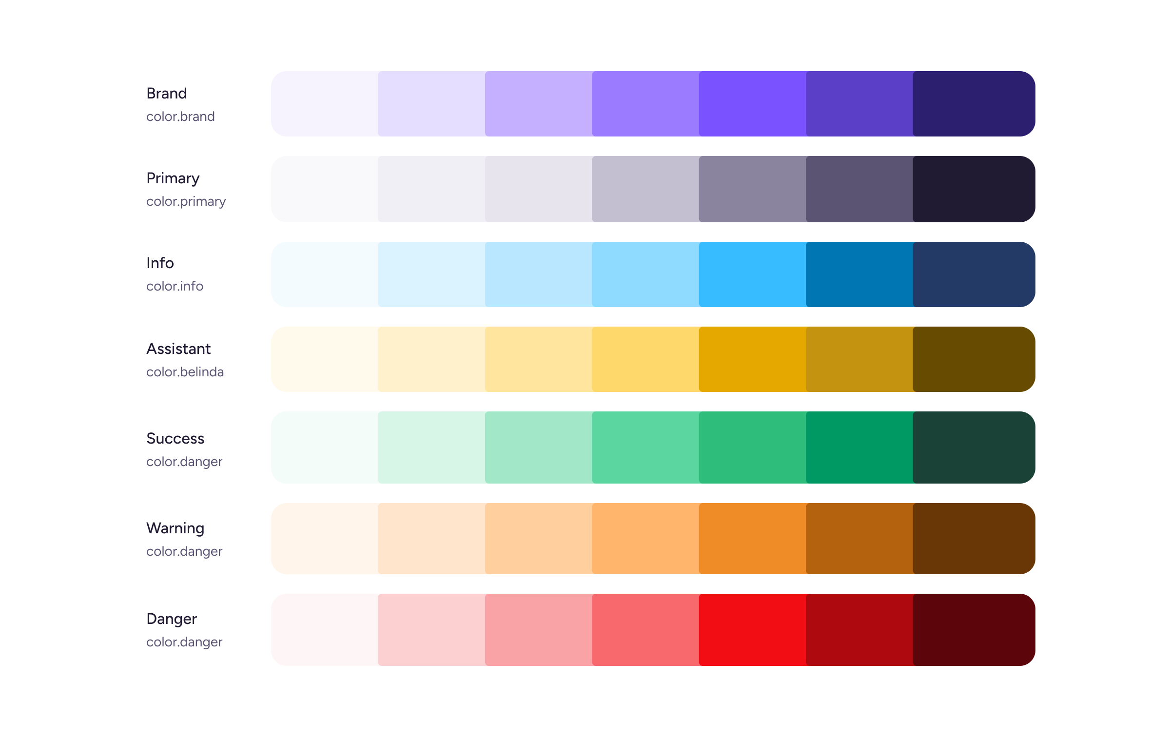
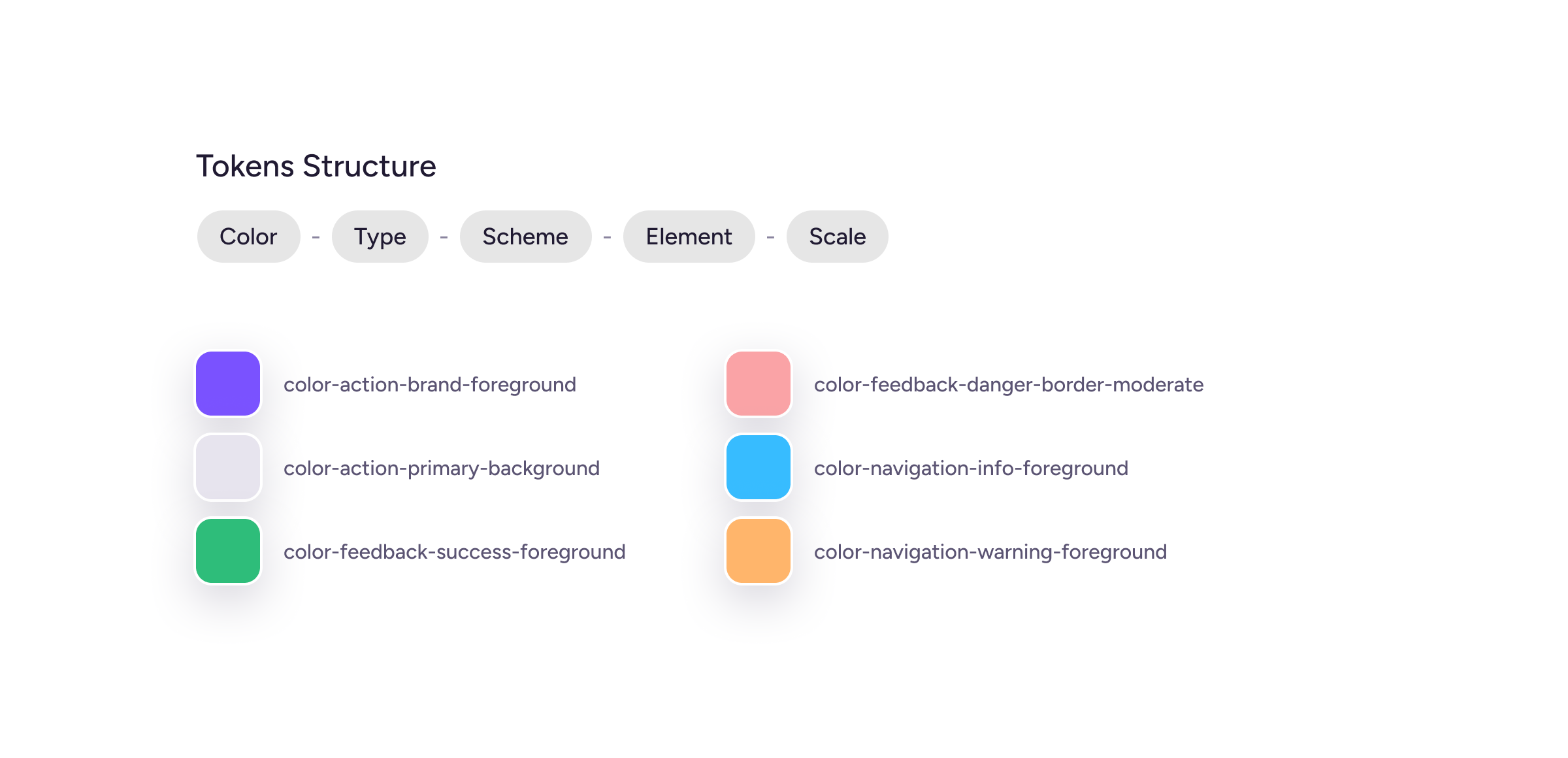
The design team explored how design tokens could support our product, brand, and development requirements. Once we had drafted the token architecture, we held additional sessions with both teams to validate and refine it.
We audited the existing component library to understand which components needed the most attention. We grouped them into three categories: components requiring a design or development update, components to deprecate, and components that could migrate with minimal changes.
We prioritized components needed for upcoming product updates and features. This allowed us to build the design system progressively: first establishing a solid token foundation, then developing the component architecture on top of it.
Documentation & Tooling
Initially, we used Zeroheight as Jacaranda’s documentation hub, providing guidance on component usage, best practices, dos and don’ts, and behavior.
In parallel, developers documented the coded components in Storybook, providing an isolated environment with live controls for testing their properties.
During handoff, components used in mockups linked directly to both the design system documentation and their corresponding Storybook implementations.
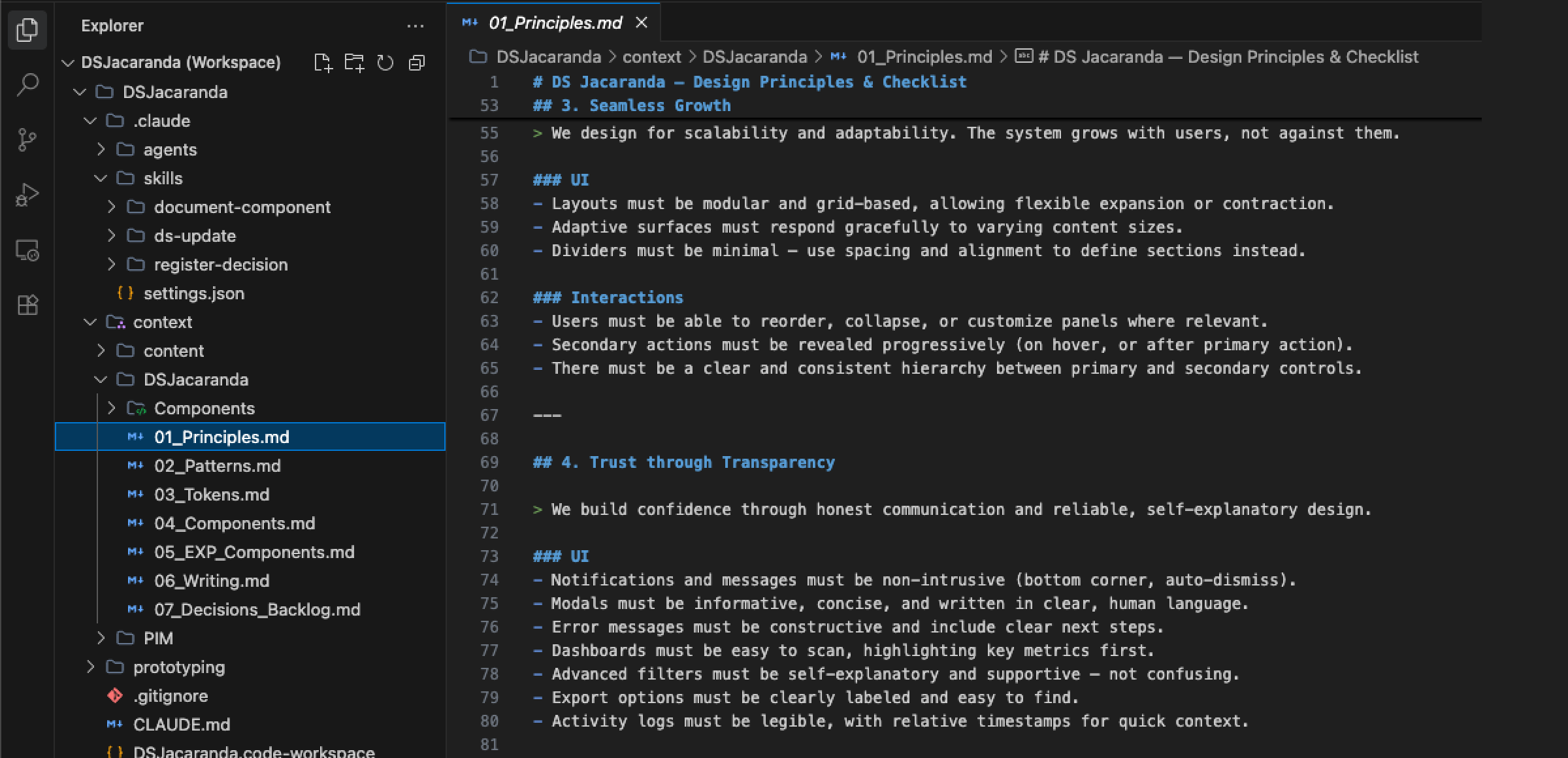
As AI models evolved, we discovered that agents could not read our design system documentation, and the content they generated did not align with the system. We moved from a traditional documentation site in Zeroheight to an AI-ready design system that can understand our design patterns and components, enabling it to generate new solutions and documentation at the same time.
The Solution
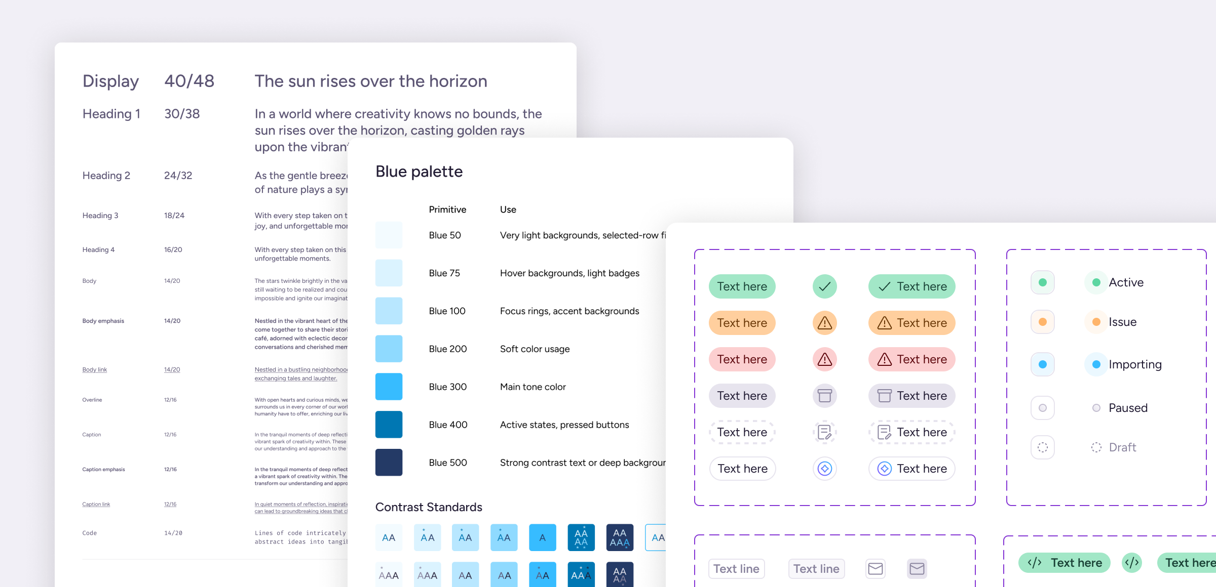
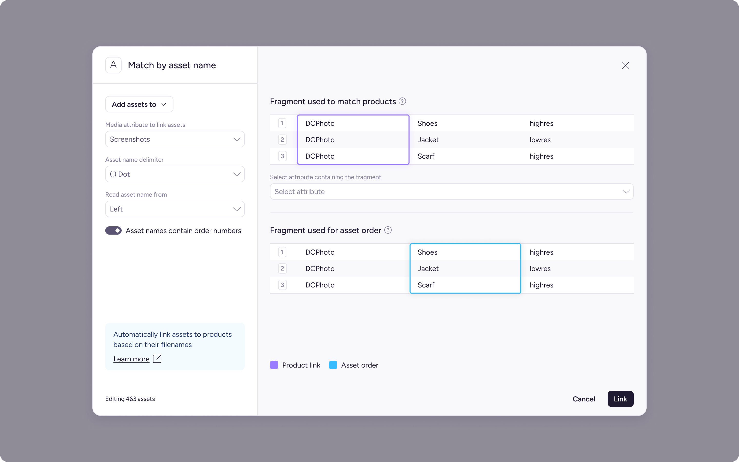
Jacaranda established a shared source of truth for designers and developers. It introduced a token-based library, clearer documentation, and a set of component guidelines agreed on by both teams.
Impact & Results
- Improved communication between design and frontend developers.
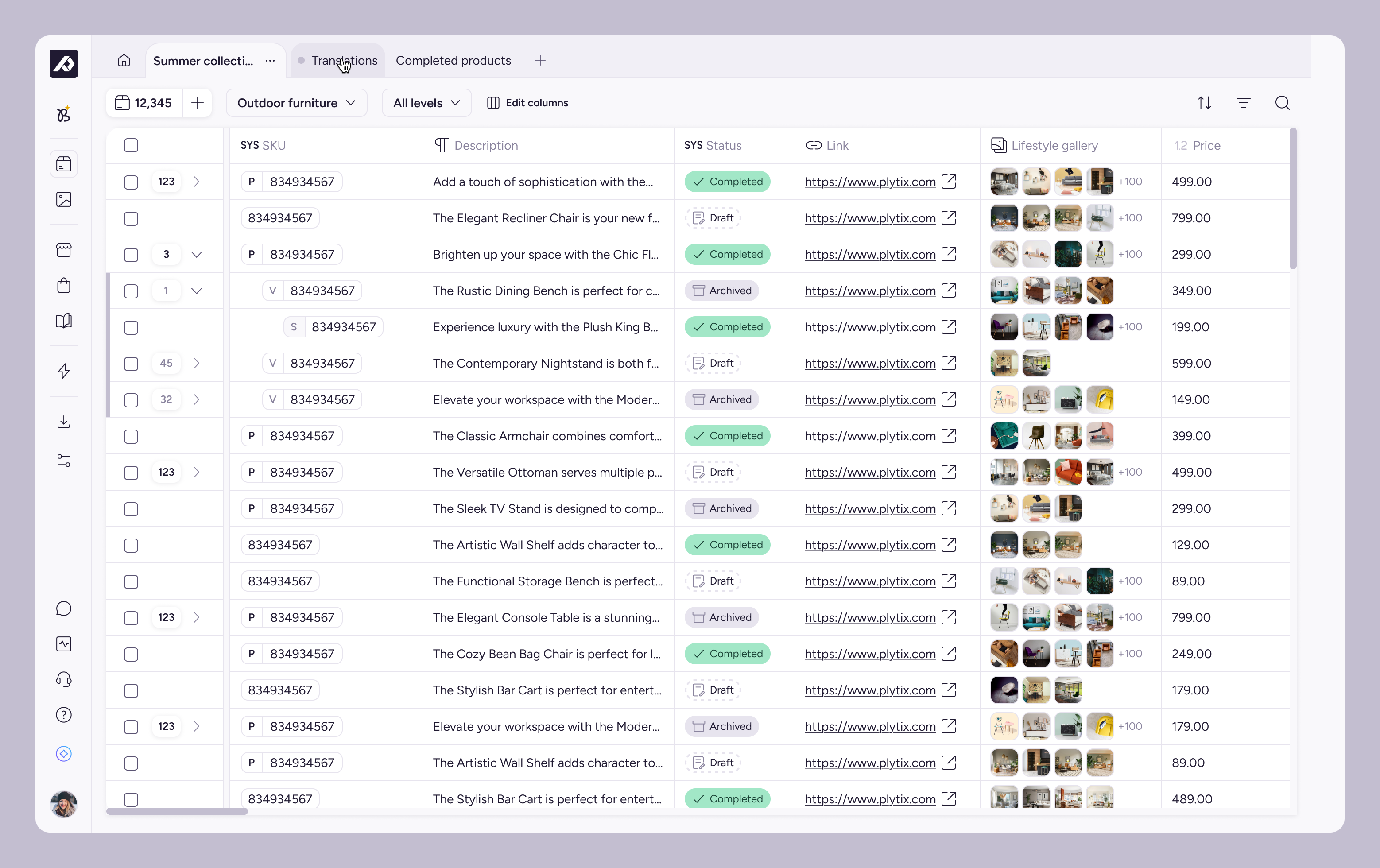
- Significantly reduced the time required for visual updates. The engineering team refreshed the platform’s look and feel in under two weeks.
- Improved the product experience through more consistent components and greater fidelity between design and implementation.
- Improved the overall quality of design handoffs.
- Reduced the time spent resolving questions during development.
Testimonials from the team
Jacaranda gave design and engineering a shared language. We stopped debating pixels in every handoff and started shipping with more consistency, and far less friction.
The look-and-feel refresh in under two weeks said more than any roadmap slide could.
Working with Jacaranda from a frontend perspective gave us a shared language with design, so handoffs are clearer and we move faster when something is still undefined.
Semantic tokens make brand and theme updates almost instant: change a token value and the look and feel follows, often with a simple script.
With the Figma MCP and tokenized styles, implementations land closer to what’s expected in HTML and CSS, so turning a design into code is quicker too.
Learnings
This project gave me the opportunity to apply and refine a range of design system methods and tools:
- I learned how to organize a large component library into a scalable system.
- I redesigned the component library, applying lessons from earlier iterations and adapting solutions as new needs emerged.
- Over time, I became more effective at identifying and resolving component issues and inconsistencies.
- I strengthened my ability to present proposals, align priorities, and negotiate solutions with developers and stakeholders.