
Redesign of Popup Architecture
UX Audit of Popup components and redesign of their structure.
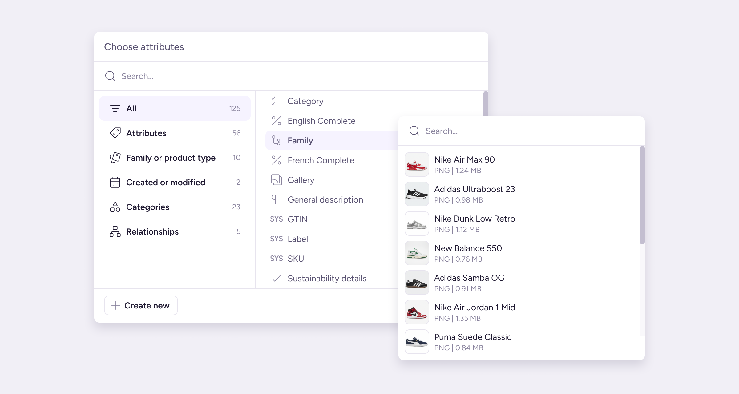
Project Overview
This is a UX audit and structural redesign of the popup component collection to improve consistency across the system and platform, and to solve UX issues.
Challenge
My goal was to simplify a fragmented popup collection that was causing multiple inconveniences.
The Plytix platform relied on popups to view, edit, and manage multiple related entities without repeatedly leaving the current screen. Alongside popups, other component types such as panels and modals were also used to facilitate user flows.
Initially, the popup collection consisted of a few components, each designed to solve a specific task or scenario. While their taxonomy categorized popups as either informative or action-based, this axis didn’t address the reality that informative popups had to support user actions.
As the platform evolved, the number of popup components grew due to their versatility and the wide range of actions, content, and flows they needed to support. Over time, this expansion made it difficult for designers to select the appropriate popup for each use case. This was resulting in a worse user experience, increased tech debt, inconsistent design solutions and detached components.
The Solution
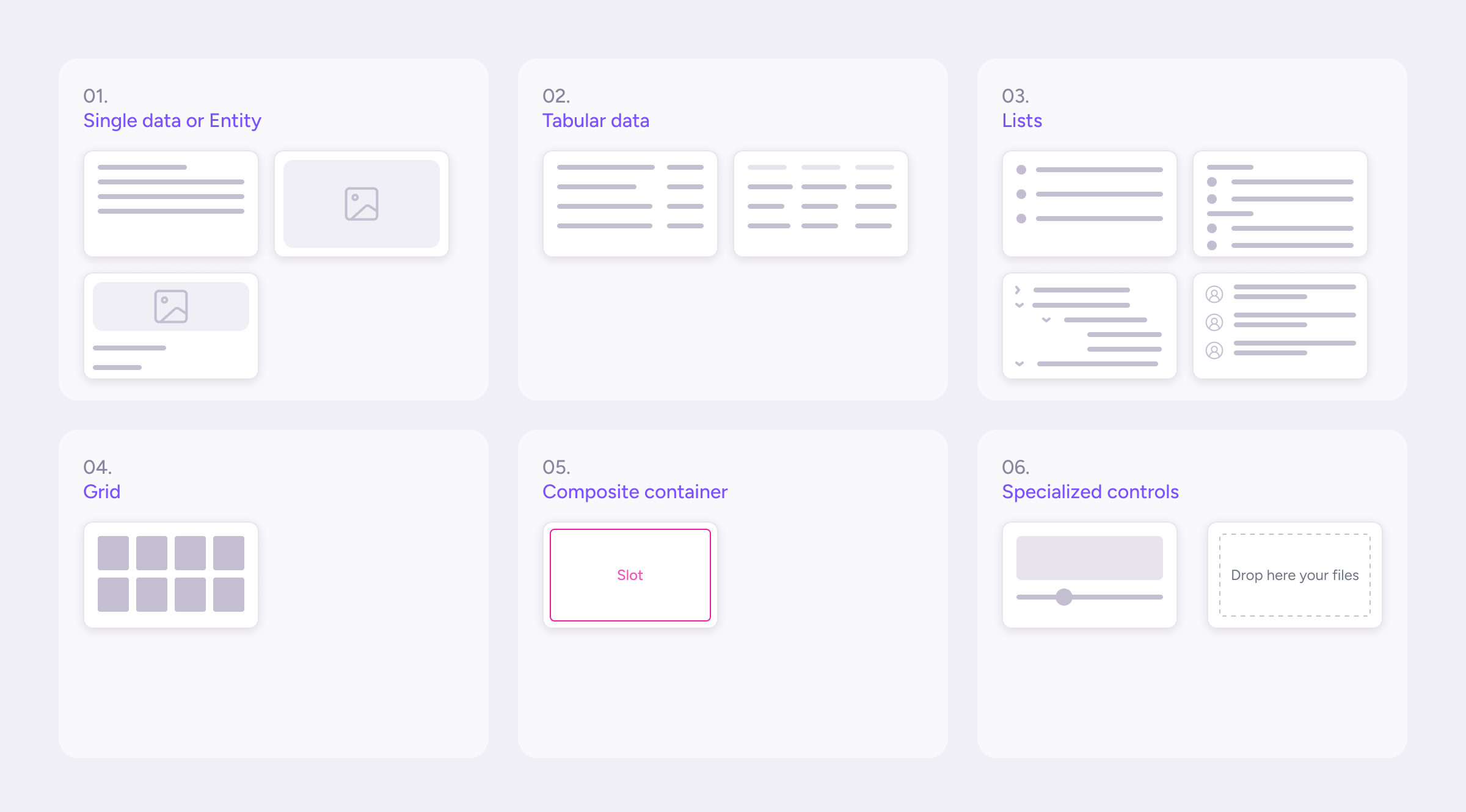
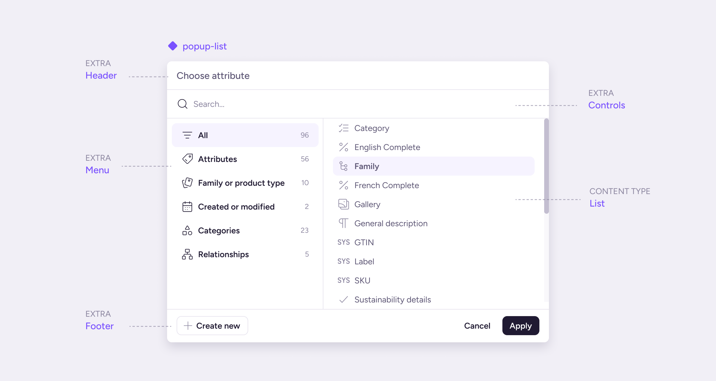
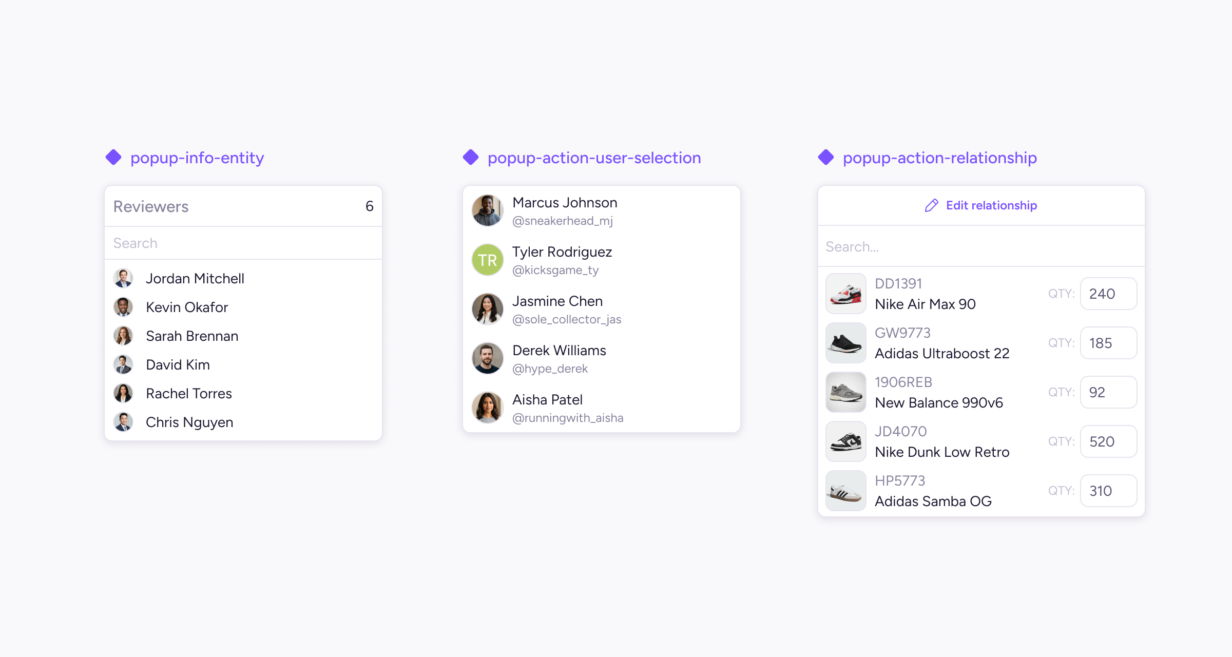
I designed modular popup components based on content type patterns that can show additional interchangeable pieces to compose the final solution. We reduced the number of popup components while keeping the scalability and versatility of this type of component. At the same time, we converted every single popup piece into a smaller component shared across the content type components.
Content type popups
-
Single entity
A single, indivisible piece of content (Simple text, Media view). -
Tabular data
Read-only data organized in a defined tabular format (Key-value pairs, Tables). -
Lists
Multiple entities, items, or events of the same type in iterable rows, which the user browses to choose, navigate, or review (Simple, Hierarchy, Grouped, Timelines). -
Grid
Collection of items arranged visually using a grid (Media galleries). -
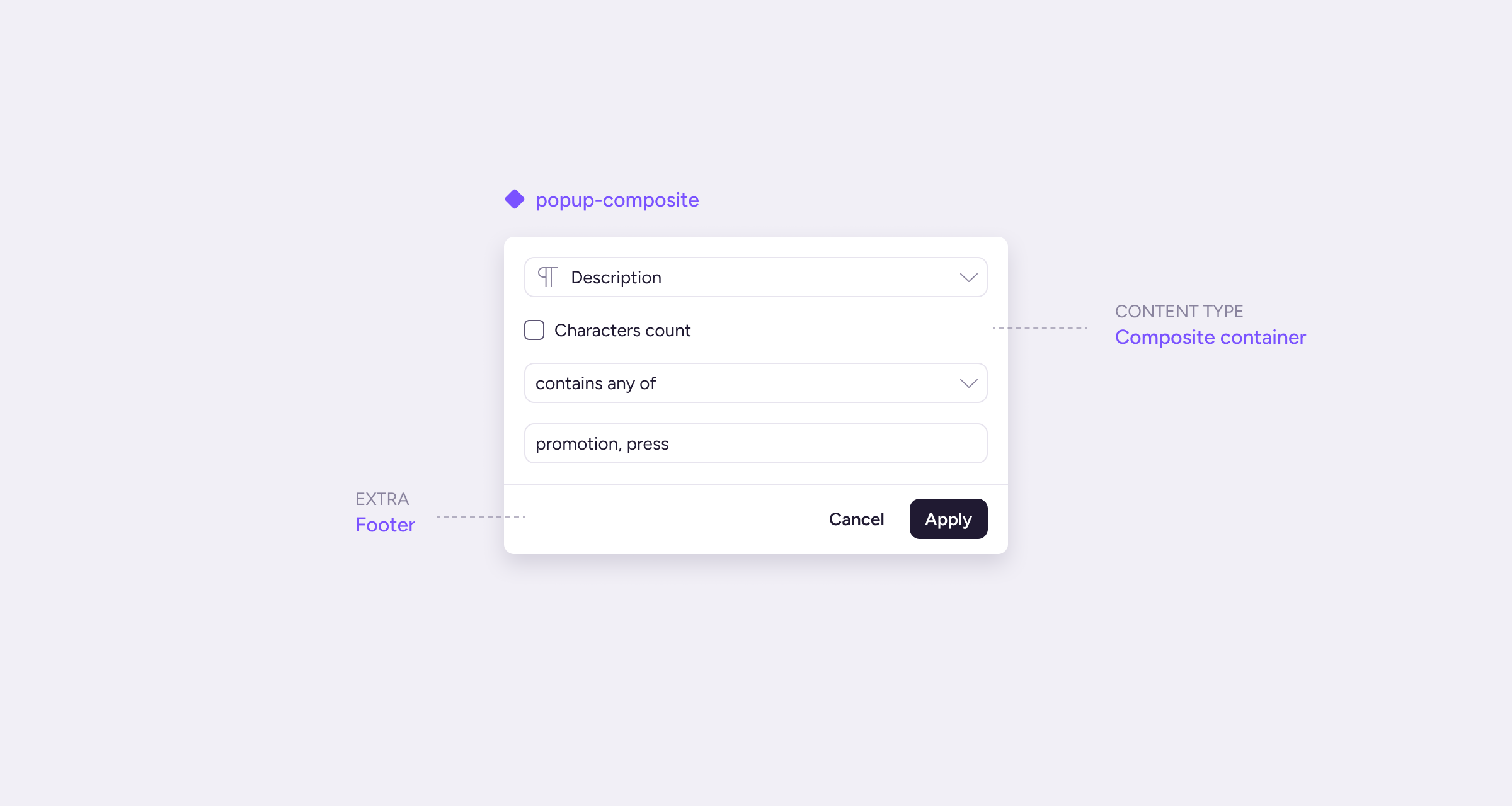
Composite container
Open content where the component provides only the shell (Forms or any custom content). -
Specialized controls
Custom tool for producing or editing a specific value, with its own interaction (Color pickers, Drag and Drop).
Popup pieces also needed to cover a variety of internal options.
Each content type also had specific rules defined for sizing or behavior based on the nature of each content type.
Approach
Audit Popup Components
First, I gathered all feedback from designers and developers related to popups and existing popup components from the design system, along with examples of how these popups were used within the platform. This process gave me a clear understanding of the number of popup components, their variations, and the use cases we were supporting.
Key findings from the audit:
- I identified approximately 35 different popup solutions registered in the platform (and increasing) across 26 unique popup components. Most of these solutions started with a detached popup component due to the lack of support from the current components.
- Popups presented multiple content types, such as lists, tables, gallery images, and forms.
- Most popups included elements like headers, search bars, action bars, and confirmation buttons, but lacked a consistent hierarchy and styling.
- Popup sizes, spacings, and interaction patterns were also lacking consistency.
The design system had 26 unique popup components.
Define structure and criteria
The project needed to define criteria to generate the structure of popups around it, a taxonomy model that I could use as a pillar for the popup components. I checked some taxonomy criteria based on context in the platform, entities, etc but most of them seem to be vague and lacked clear guidance about what to use and when. Most popups had something in common but still an identifiable property that could be interpreted as the main criteria, each popup was built around a specific content type structure that largely determines the options that the component would integrate.
Impact & Results
- Popups became more scalable and customizable for different use cases without creating new components or detaching existing ones.
- Choosing the right popup was a direct choice for designers based on the desired content structure.
- Improved consistency for all popups.
- We reduced the number of popup components to 14 (of 26), one for each sub-content type.
Learnings
This project gave me the opportunity to learn:
- Approaches to component taxonomies.
- Working with large component collections.
- Leveraging Figma Slots and component architectures.